Business Flyer Design Tips That Will Bring in Clients

For many, traditional forms of advertising, such as flyers, are already outdated. But haven’t you noticed that in this day and age, you’re still being handed out flyers? The reason for this is it’s still as effective as ever. Whether you’re a startup or a big business, your brand will get many benefits if you add flyers to your marketing strategies. The downside to it is that designing flyers isn’t as simple as some people think.
For now, here are some flyer design tips to help you with your brand campaign:
1. Keep It Simple
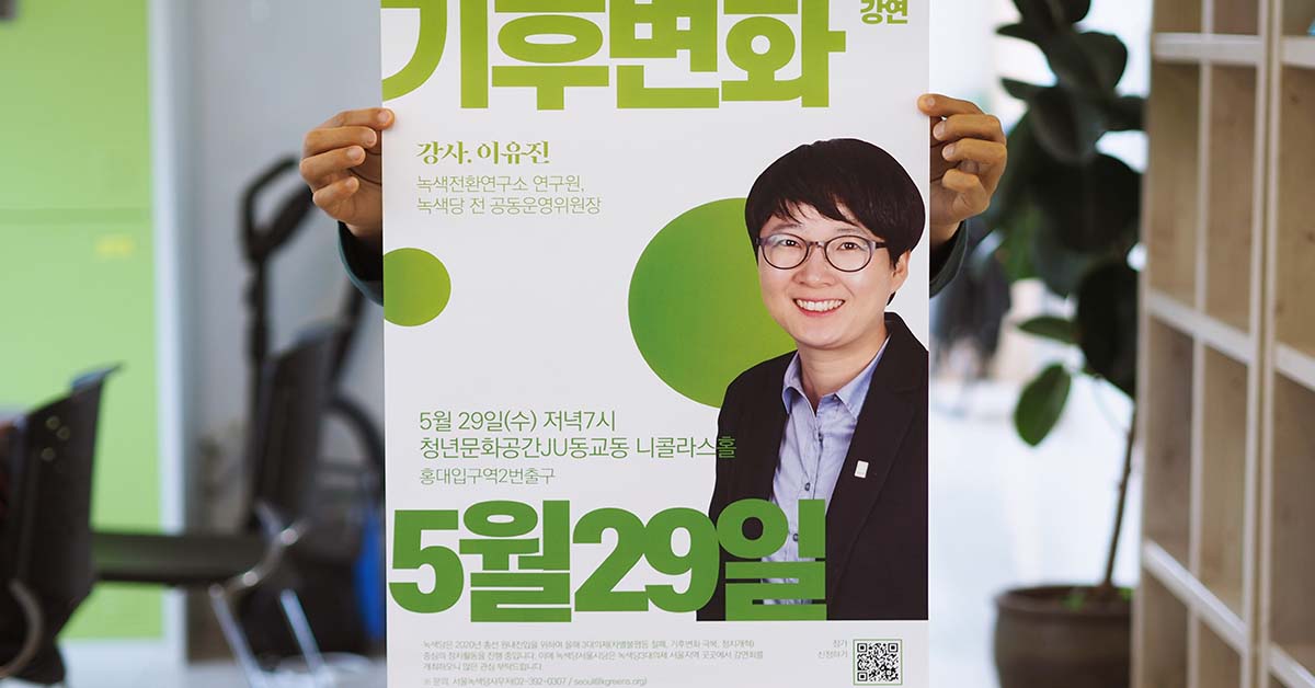
A simple design can have a considerable impact on a flyer. Although it may be tempting to dump every ounce of your creativity onto a design, it can come off as an overwhelming experience. When you’re trying to promote your business or events, you need to nail it.
- Limit words, graphics, and space. When drafting the campaign, have a layout of the keynotes, and decide what’s worth keeping. Include illustrations that fit the content and only promote one thing from your business.
- Organize your information. Have a clear idea of what you want to promote. Don’t put all of your information into one section. You can organize your thoughts by using bullet points and text boxes. Use the opportunity to create a set of
- Be wary of your font choices. The more fonts you’re using, the more confusing your business flyer gets. It may be tempting to want to explore every creative element, but there is a thing as too much creativity. The poster has to be legible enough for people to read.
- List your major benefits. You want the right amount of content on your business flyer; readers have a hard time retaining the correct information. So, provide your consumers with a quality flyer. By listing the significant benefits only, you save people a lot of time from pointless reading.
2. Color Scheme
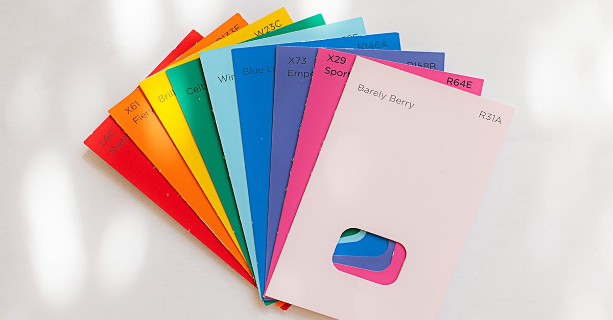
Color has a vital role in enticing eyes to your poster design. If you have a set of brand guidelines, make sure you follow them. Understand the color theory and pick colors that best represent your company’s personality.
- Use bold colors. You want your colors to stand out from consumer’s junk mail or useless advertisement. There is a lot of competition when doing email marketing. So, make sure to stand out through aesthetics.
- Use your company’s branding guide as a reference. If you don’t know, a branding guideline is a set of pre-selected fonts, colors, design elements, layouts, logos, and sample copy for design). Allow customers a chance to remember your brand by having consistent content. When they start to recognize your brand color or logo, then you’ve successfully gotten their attention.
- Stay in the same color family. Even if you have no experience in design or understand the color theory, you should know not to play around with crazy colors. Stay consistent and have a design that is easy on the eye. However, you don’t have to stick with one color. It means making sure the ones you do pick don’t clash with each other.
3. Keep Your Content Simple
A text-heavy flyer is a huge turn off for consumers. The more complex a poster is, the less appealing it looks. If you want to add in a written message without losing consumers, here’s what you do:
- Include a call to action. Flyer design tips will always include a reminder for a call to action feature. The whole purpose of creating a business flyer is to convert new leads. Without a call to action, your consumers won’t know what to do next.
- Add customer testimonials. Show you’re dependable and reliable by including customer-provided testimonials. Direct reviews from corporate are unreliable because it comes off biased. Customers listen to one another for product promotions.
- Make it informative. A flyer is meant to attract new customers, so let people know what’s advertised at your businesses. Images and a few words may be all you need to get all the information across.
4. Create a Clever Headline

If you want to write an attention-grabbing headline, there are a lot of principles to follow. You have to understand how to address your message correctly. Advertise your business by attracting consumers to your headline. Flyer design tips to follow are:
- Use the word “You” in the headline. Make consumers feel special by using your headline. Add a purpose for your flyer, and address who you’re speaking. It makes them feel better knowing they’re being talked to directly.
- Have an exciting and relevant headline. Play around with words, but not too much where you lose your purpose. Words have power, and if you use the wrong ones, you’ll get the wrong message across.
- Use a simple and legible font. Headlines are essential; they are the first thing readers see. So, make sure they can even read it first before judging the content. We mentioned already about using fewer fonts in the flyer, but your headline should be one consistent font.
- Make it easy to understand. You can’t be everywhere at once. If people don’t understand your business flyer, then you’ve wasted your time and money on the campaign.
5. Incorporate Your Logo and Branding

Design is important in a flyer, but don’t forget about adding your logo. By being consistent, customers will remember your brand. Build onto your brand and stay connected to create customer loyalty.
- Establish brand recognition. You won’t be able to give people a chance to remember your brand if you change it too often. Follow the brand guidelines, so your branding gets the recognition you’re looking to improving your business.
- Keep your branding connected across all digital and print platforms. Thanks to the digital age, there are so many platforms online. Meet your consumers online to where they are looking and promote your print and digital business flyer. Find your consumers before they find you. Know how to target them with your up to date social media graphics.
6. Attention to Visuals
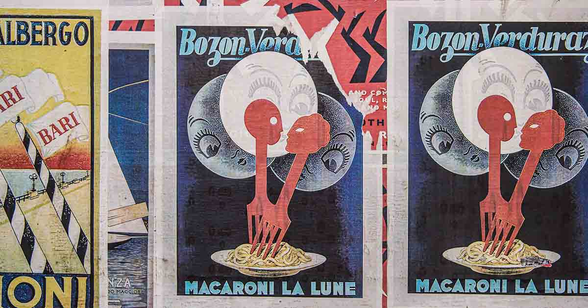
A blurry photo is a turn off to readers. To the average person, a low-quality photo implies your business is unprofessional and unreliable. To make sure you’re paying attention to your visuals, here are three things to remember
- Images matter just as much as the text. 40% of people retain images from flyers. By leveraging on aesthetics in your business flyers, consumers will respond more to the campaign. Some campaigns don’t use words anymore and even remove their logo altogether.
- Pick relevant images only. Images are used to reinforce your message and branding. Graphics will lead to the overall flow of your content. Pay attention to your business communication by selecting appropriate images.
- Consider visual guides. There are specific guidelines people follow when creating visuals. One of these is the golden ratio, which is an almost perfect spiral. Many people use it in art because of how it’s measured out. You don’t have to follow this one precisely, but think about what you can do to get similar perfect imagery.
7. Know Your Target Audience

Create a flyer that has a purpose. Understand who will benefit from your advertisement and design for them directly. Most flyer design tips emphasize the importance of target marketing.
- Keep location in mind. Over 90% of brick and mortar business sales come from people living 3 miles of their location. So, know who you are creating for so that the business flyer caters them.
- Address their needs and desires. Directly speak to the people who are needing help or have needs.
- Play on their needs. Flyer design tips always emphasize the importance of having a direct message. So, address an issue and be the solution to your customer’s problems.
8. The Right Font Choice

The right font choice can go a long way in making your flyer design effective. A flyer has to be readable to add value to your marketing strategies. People will likely discard your flyer when they can’t comprehend it. And the time for your flyer to do its job is minimal.
At a glance, the content of your flyer has to get the viewers’ attention. The right set of fonts should capture their interest easily and get them to read all that is written on it. The role of a flyer is to spread information, and a good font choice can communicate your message well.
9. Don’t Forget to Add Details

It may seem obvious, but details such as contact information can be forgotten easily. Add directions to your physical store or how to find your website and social media platforms. It doesn’t have to take a lot of space, but it’s imperative that you add these in your flyer design.
10. Choose the Right Paper

Choose the quality of paper that you’re going to use. It has to be made with high-quality as it is going to be handed out. It needs to weather the exchange of hands to make it as far as it should.
Final Thoughts
There are so many ways to make a good business flyer. These seven tips will get you there for sure. You need the ideas, but you also need the best graphic design to back up all your great ideas.

