Hook Your Next Client With the Best Business Card Design
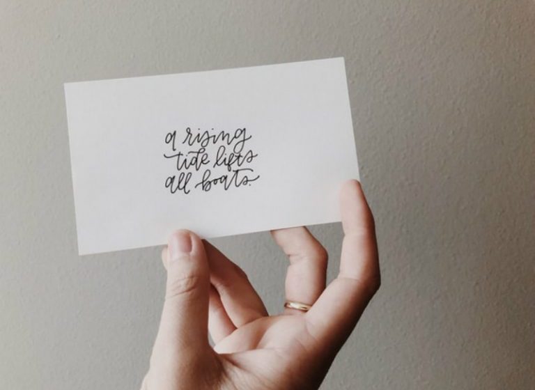
They say that carrying business cards is unnecessary. After all, most people can now easily exchange contact details using smartphones.
We beg to disagree.
Business cards are still an effective tool to introduce yourself and your company. It might be small but if done correctly, can create a big impact. That is why it is important that you create a business card design that will strongly deliver your brand’s message. You shouldn’t settle for something because it looks cool.
Anyway, if you are having a hard time brainstorming about your business card design, worry no more. In this article, we give you the top 25 examples of business cards for professionals. Hopefully, you can get inspiration from here.
1. Chomp
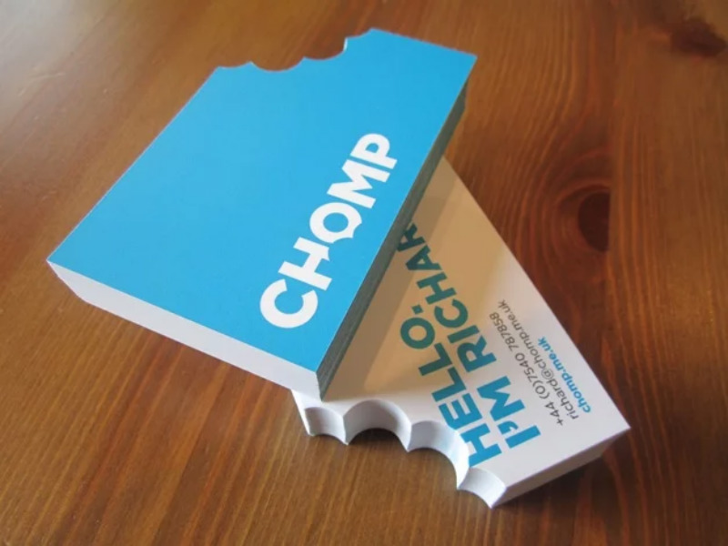
Who wouldn’t be amazed by this unique business card design? Apart from being different, you already get the impression that the company thinks outside of the box and will go the extra mile to stand out. If you ask us, they sure did a great job. It’s also consistent with the company logo’s design.
2. Michigan & Manchester Consulting Group
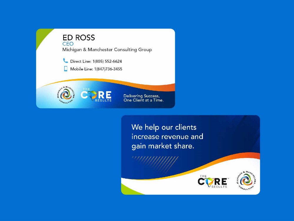
This business card design is effective if you want to clearly define what your company does. The technique of adding your company mission is simple yet very much advisable. For startups and other brands that would like to make a mark, you can use this strategy.
3. Counter Creatives
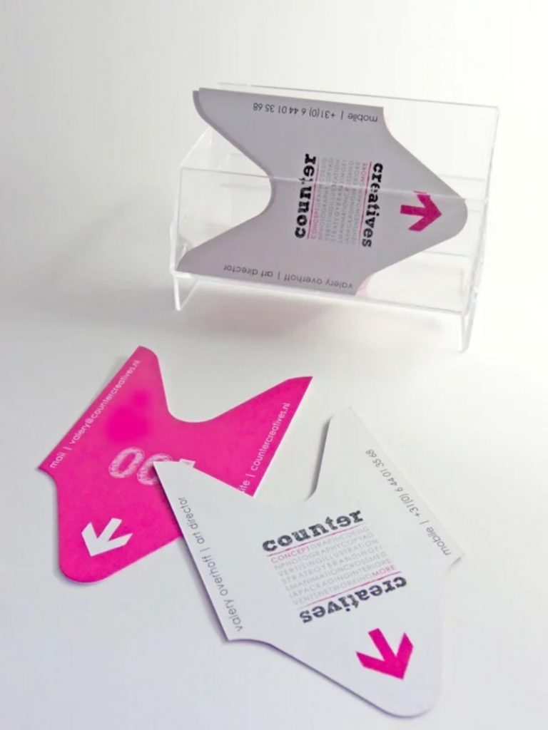
Just like Chomp, Counter Creatives was brave enough to use a unique shape for their business cards. It actually resembles a ticket. Plus, you will notice different typefaces which make this more interesting.
4. Matheus Dacosta
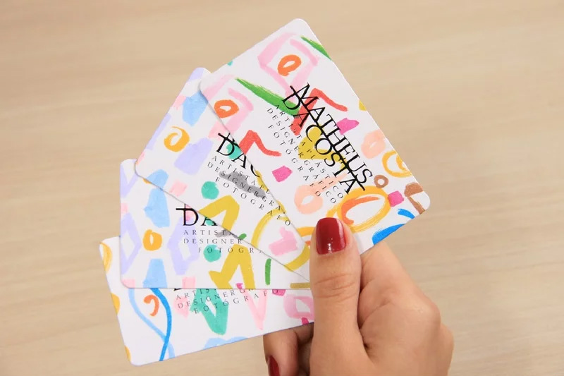
This business card might look simple but you have to look at the details. Did you know that the designs are actually hand-painted? That gives the cards its own personality. If you are an artist and you are introducing yourself, this might be a good idea.
5. DocuWhiz
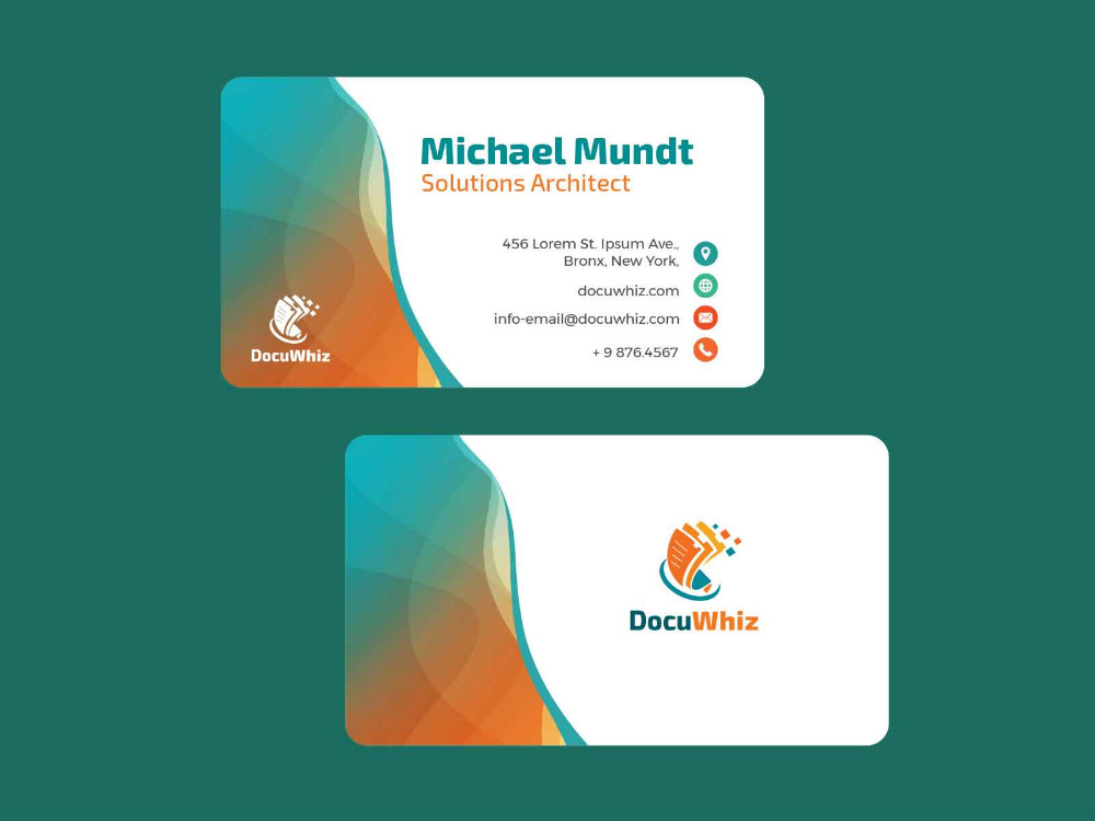
Instead of working on straight lines, use more organic shapes in your business card. This gives the impression that your company is fluid, flexible, and can easily adapt to what your client needs.
6. IS Creative Studio
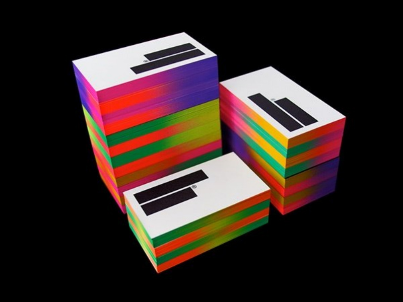
Who says you can’t add neon to your business cards? IS Creative Studio was able to introduce bright colors and it matches the card’s minimal design. If you can’t do much to your layout, then go ahead and splash striking hues.
7. Omelet
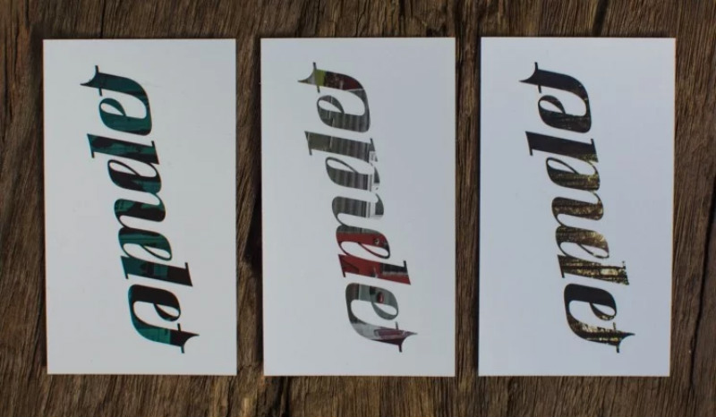
You can also use ambigrams to add flavor to your card design. This is what Omelet did. The business card design is unique yet it still looks professional.
8. Nymbl
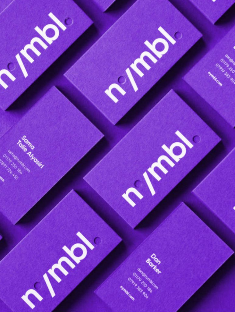
The use of holes in their business card design gives it a more playful look. And the bold color will definitely stand out wherever you keep it.
9. ENGAGEathon
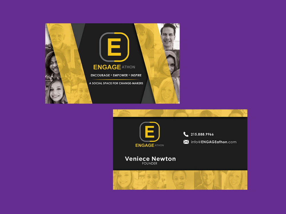
The use of actual photos in the business card design is a smart idea considering that the company is a social space. Again, this means that designing business cards is not just about being unique. It’s all about clearly defining your business.
10. Bespoke
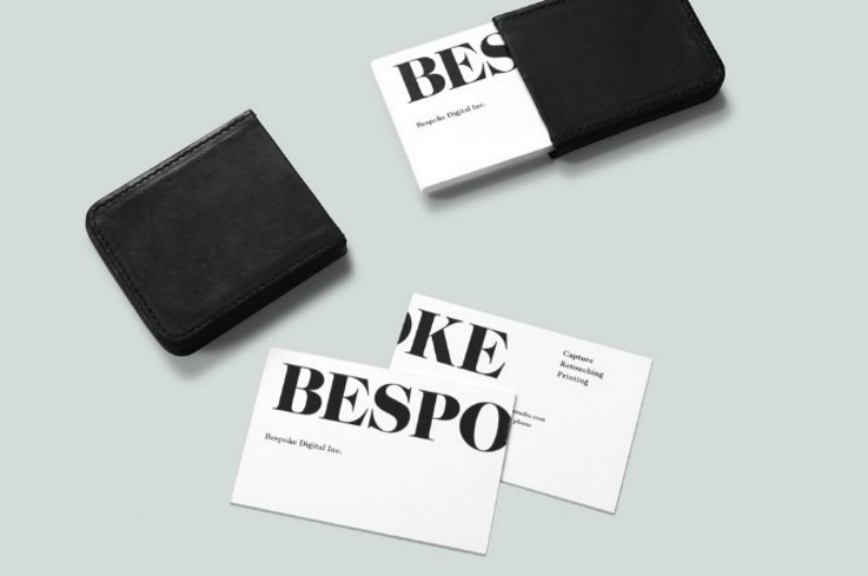
Another technique we can use in business cards for professionals is seen from Bespoke’s sample. The name of the company is extremely big that you have to flip the card to read it. Yes, it’s different but effective.
11. Katsy Garcia
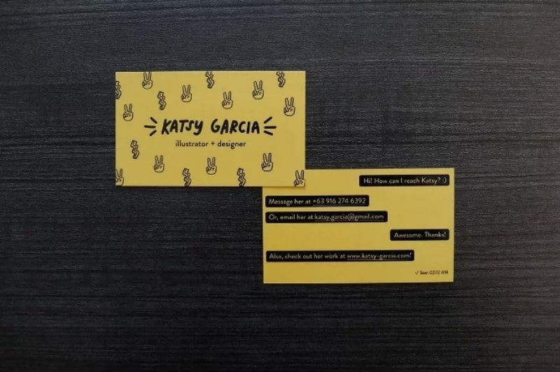
Who says you have to follow the norm? Katsy Garcia’s business card is definitely a must-see. Her contact information is displayed in an unconventional order and it’s actually effective if you want to start a conversation.
12. Shi Shi Cut & Dye Shop
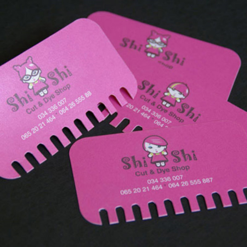
Next on the list is the business card from Shi Shi Cut & Dye Shop. It resembles a comb and that’s a giveaway about the industry they are in.
13. Pilates Studio
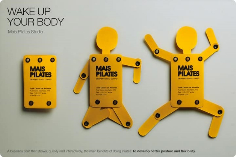
When you are practicing Pilates, it entails a lot of flexibility and movement. This fun business card says it all.
14. Autumn Dental of Mokena
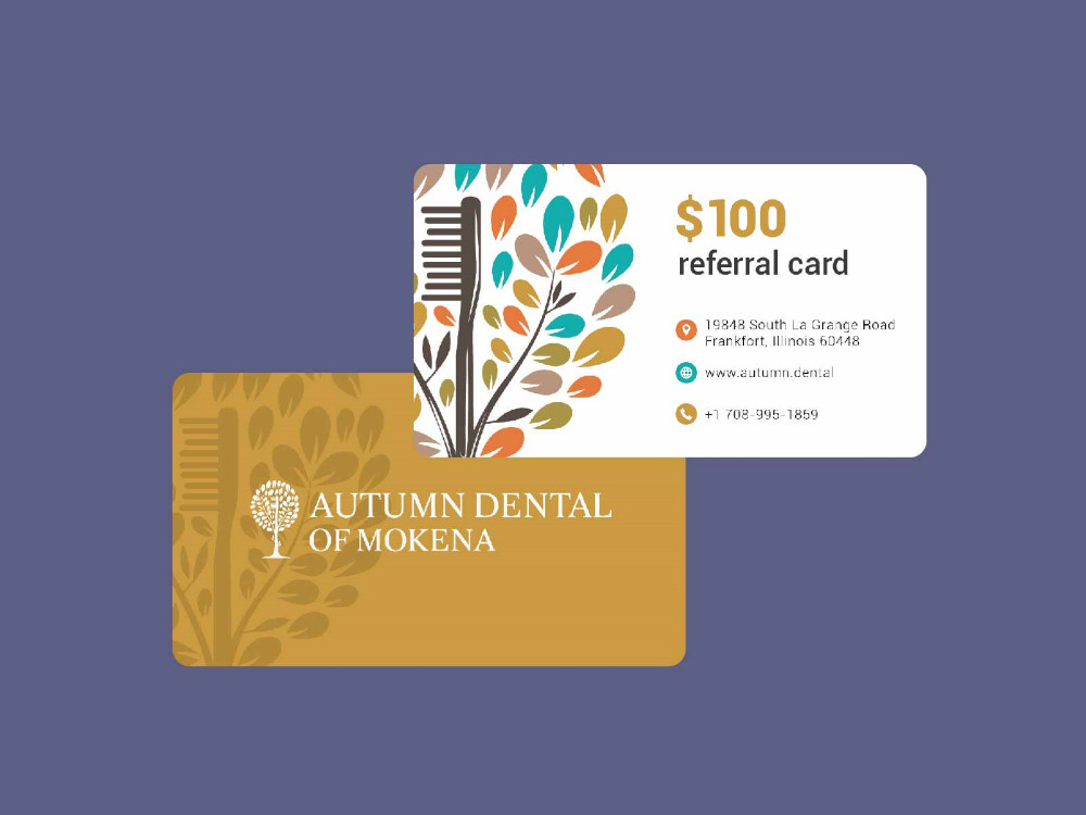
This business card design is sleek, smart, and screams professionalism. But what we love about this design is that it serves as a referral card as well. This is a good strategy because you are naturally widening your market.
15. Coaster Cards
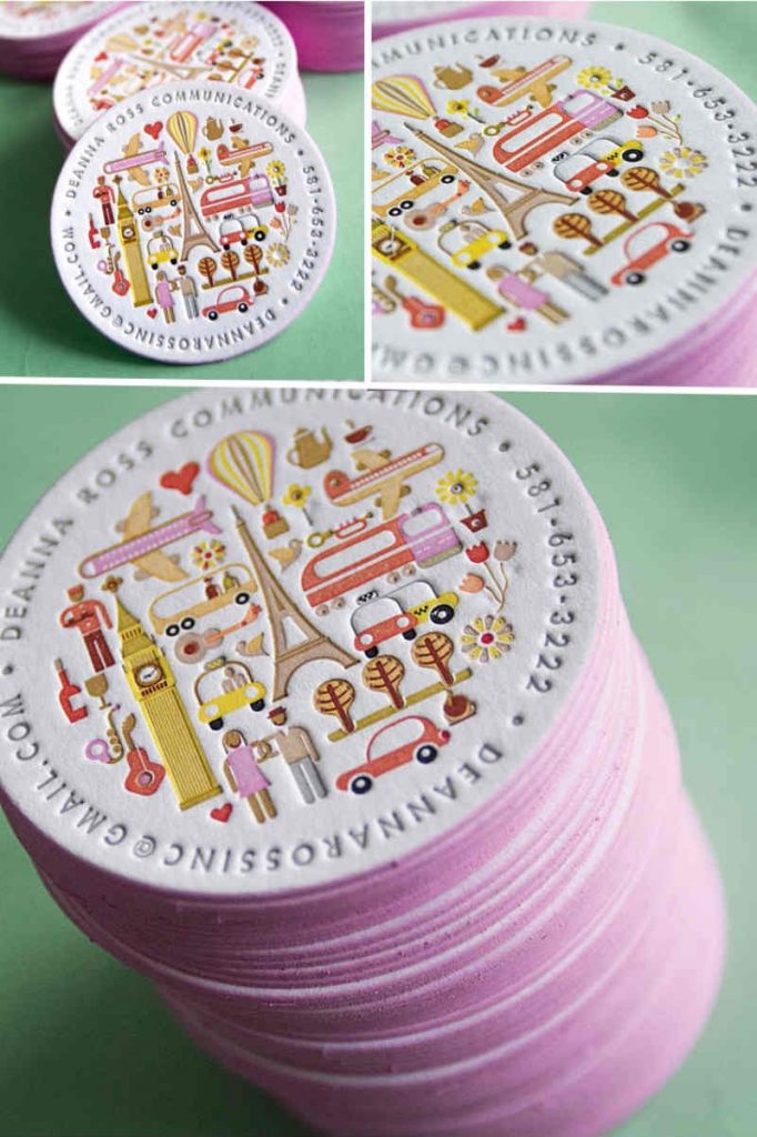
Most business cards are left unseen. We keep it in our drawer and will just get it out when needed. But if you want yours to stand out, then make sure it can be used for another purpose. How about this coaster card idea?
16. For Cosmetic Surgeons
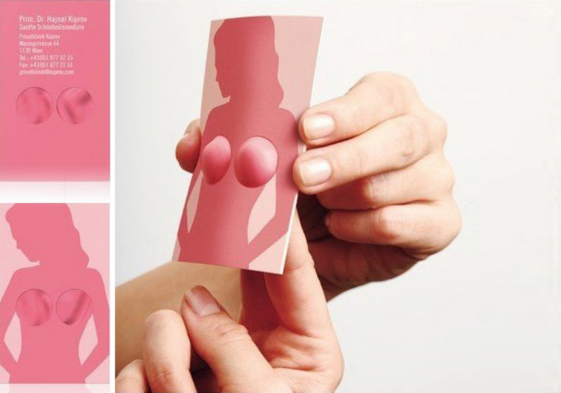
Now, this looks promising, don’t you think? It’s cute, unique, and fun. This goes to show that if you are designing a business card, you need to be highly creative.
17. Cheese Grater Business Card
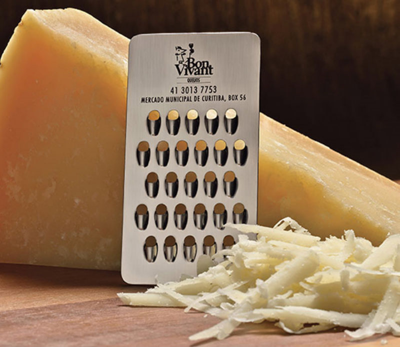
Why don’t you create a business card which is functional like our sample here? People will definitely use it and your contact information will be seen all the time. The approach is similar to the coaster cards we mentioned above.
18. Another Bloomin’ Designer
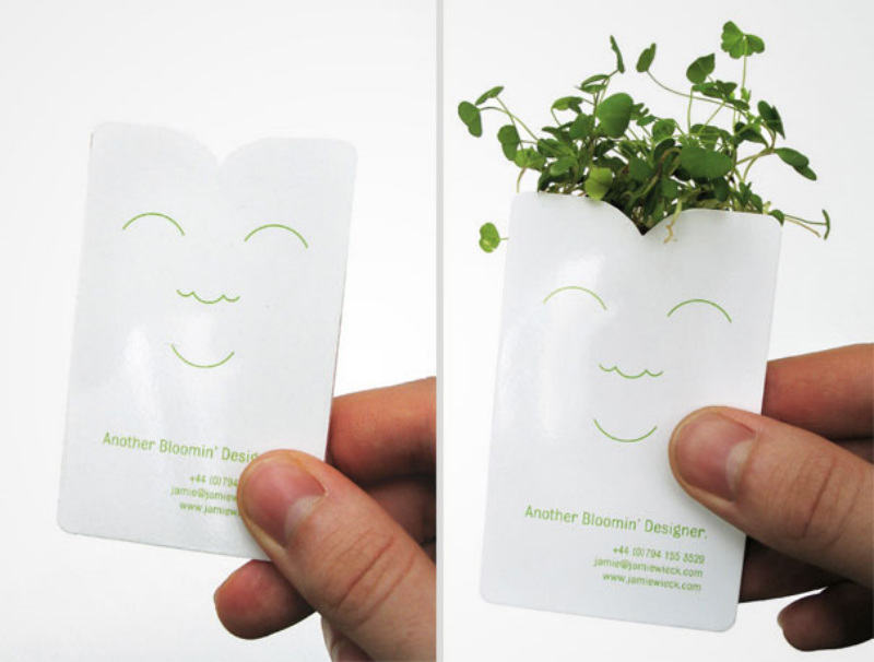
Here’s another business card that serves a dual purpose. Imagine growing seeds from it! Surely, it will make a mark. And let’s not forget – it’s eco-friendly too!
19. Ellis Pond
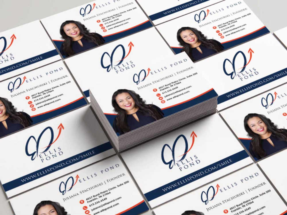
If you are representing your brand, then placing your photo can be a neat idea. This is recommended if you wish to put yourself out there and get noticed.
20. For Butcher Shops
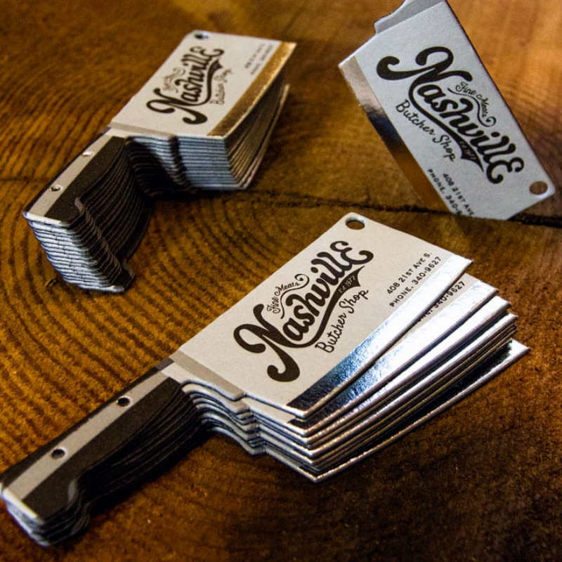
Here’s another creative way to introduce your business. The butcher shop from Nashville has a business card shaped like a real butcher knife. You don’t even have to guess what they do for a living, do you?
21. S.M.A.S.H
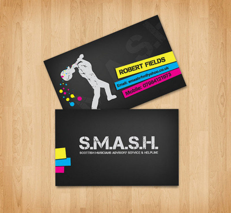
Again, you can break the norms when designing a business card. In this amazing sample, the names and contact details are not in a straight line. It makes it more interesting and it honestly looks cool.
22. Latona Marketing
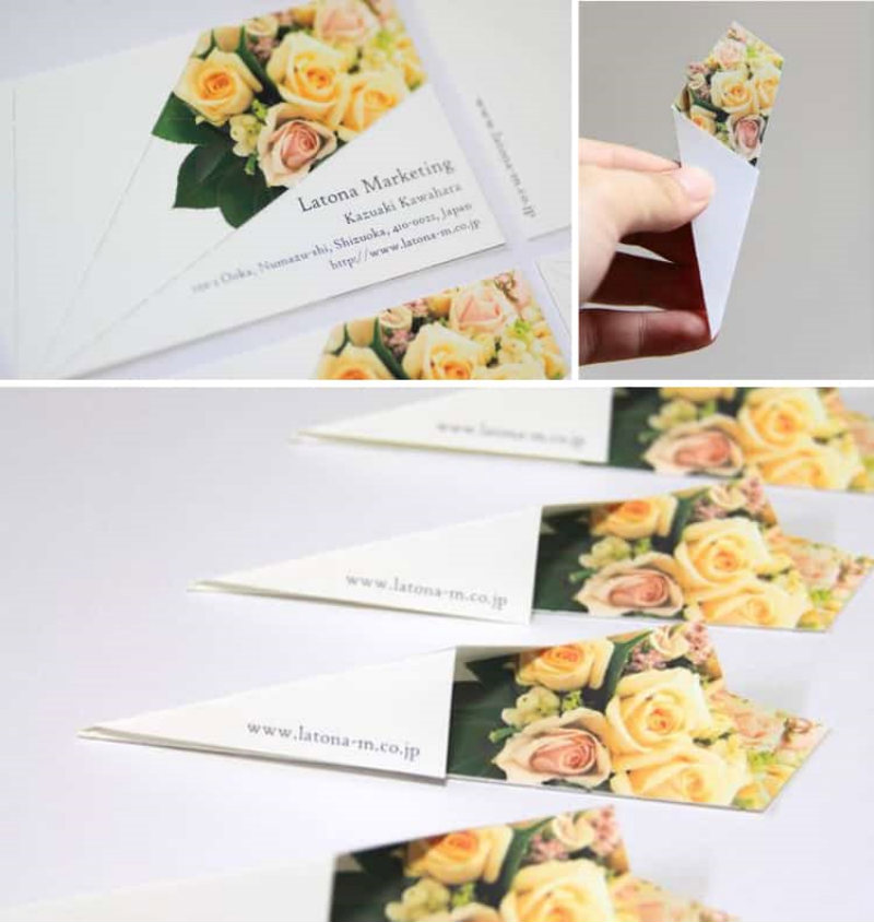
A bouquet of flowers gives that warm and welcoming feeling. With this business card, it seems that you are already embracing potential business partners and future clients.
23. Francesca Pasini
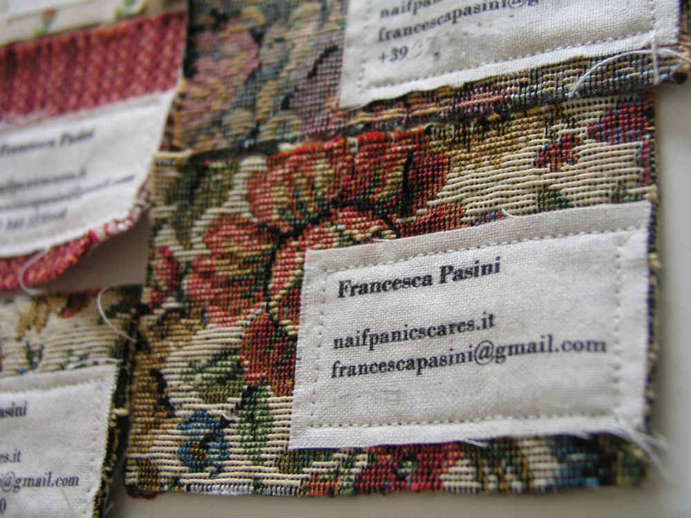
Sometimes, it’s not just about the design but the materials used in the business card. This can be seen from our next sample. It’s an out-of-this-world idea that will make your business stand out from the rest.
24. Emmi Salonen
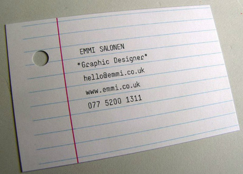
This card is unique because of its very standard look. It gives that nostalgic feeling as well. It’s simple yet fairly different and we have to say, certainly effective.
25. McDonnell – Phillips
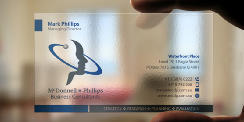
Show that you are transparent by giving out a literally transparent business card. It has that ‘wow’ factor and a number of brands are already using it.
Conclusion
When designing business cards for professionals, one must understand the industry, the core business, and what makes the brand different from its competitors. Having said that, research is needed. Of course, expertise and the right tools must be at hand.

