Stunning Examples of Ecommerce Website Design for Inspiration

Gaining new customers the old-school way no longer promises an increase in revenues the way it used to. A CNBC research shows that a massive amount of shoppers visit a store’s website before going to their physical store to buy. Despite this, a SurveyMonkey Small Business survey shows that nearly half of small businesses in the US do not have a website yet.
According to Oberlo, there are 2.05 billion global digital buyers in 2020. If you want to get a piece of that humongous pie, you need to have an eCommerce website design. Sadly, it’s not as simple as getting a website design. Ecommerce website design is so much different.
The Difference Between Regular and eCommerce Websites
When we say regular websites, we mean those that generally provide information. Some examples of these are news websites or those that inform visitors about a business. You can have one that you can use to promote your brand or showcase your products and services.
On the other hand, an eCommerce website is specially created to sell online. It has gateways for payments and customer service support. It is more business-centric while a regular website has more content.
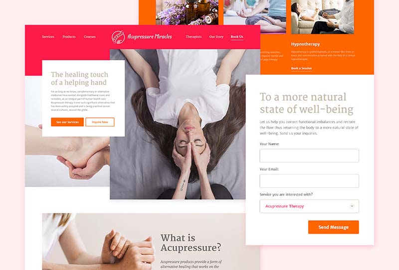
While a regular website can be used to sell, payment is usually made outside of the platform. An eCommerce website has the capability of accepting your payments and arranging shipment or delivery of goods. It is designed to provide security that regular sites may not need.
eCommerce Website Designs to Inspire You
Here are the best eCommerce websites we found that are worthy of getting inspiration from.
Allbirds
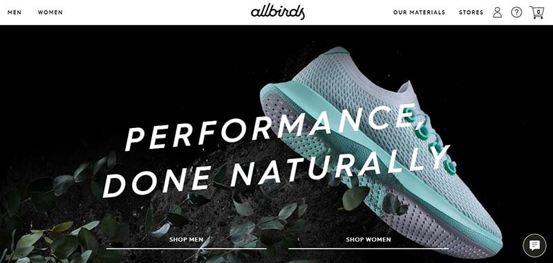
Highlighting the beauty of their products, Allbirds emphasizes one of their shoe designs on their home page. They placed the brightly colored shoe on a dark background and added negative space all around. This leads the visitors’ eyes to the product, which is the main reason for having an eCommerce website design.
Blik
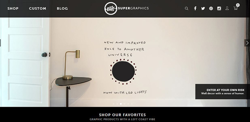
Selling art supplies, wallpapers, and many others, Blik‘s eCommerce website design is an excellent example. The site’s brilliant layout won’t leave you wondering where to go to next. Navigation is uncomplicated, and the products are laid out neatly. Finding what you want is easy and straightforward.
Grovemade

A wooden accessories company, Grovemade‘s eCommerce website design uses lifestyle shots of their products. The images show how beautiful your home or office would be if you add their products to them. The overall atmosphere of the site is light and fun, as you can see from the part where they showcase their staff’s profiles.
The Green Glass Co.
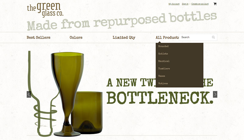
Keeping it minimalistic, The Green Glass Co.‘s web design is perfect for the message they want to convey about their brand. It’s clean and crisp and has a neat layout that’s pleasing to the eyes. Even the font choice superbly fits their brand personality.
Curology
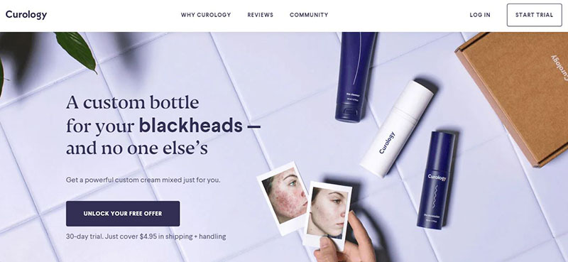
Capitalizing on providing customized products, Curology‘s website shows precisely that. The line “A custom bottle for your whiteheads/wrinkles/breakouts/zits and no one else’s” makes it very clear. To show the many ways their products can help you, the words whiteheads switches to another one every few seconds.
Final Thoughts
Before thinking of creating your eCommerce website design, check out the sites listed above. They will give you an idea of what you must have in yours.


