25 Examples To See Before You Create The Best Homepage Design

Your website only has 50 milliseconds to make a good first impression, according to studies conducted by Taylor & Francis Online. This is when your homepage design will bear the brunt, as it’s the first page visitors see when they find you. Your website design affects the perceived authority and trustworthiness of your business, the reason you must place extra effort into it.
The same study shows that 46% of consumers find a company credible based on the visual appeal and aesthetics of their website. If you think this is a monumental task to achieve, think twice.
Why is Homepage Design Important?
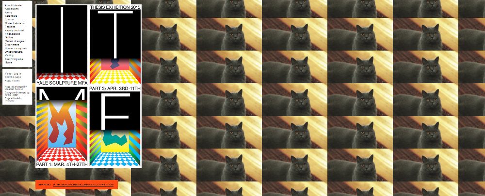
Sadly, the saying “don’t judge a book by its cover” does not apply to your website’s homepage design. John Waters, a veteran in Web designing, said in his book The Real Business of Web Design, that 94% of negative website feedback was design related. To prove this point, take a good look at the example below:
Once upon a time at Yale University School of Art’s history, their homepage design looked like that. You’d expect mind-blowing design from a school that teaches art, so this is truly disappointing. Now that you’re getting the drift, let’s look at what an excellent home page design looks like:
1. Coca-Cola
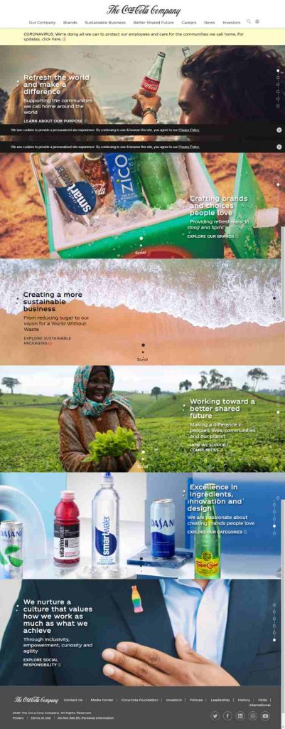
One of the essential criteria of a great marketing strategy is to show people who you are and what you believe in. Being a well-known brand, Coca-Cola needs no introductions. But looking at their homepage design, they did this superbly.
2. HubSpot

The beautiful graphics, call-to-action buttons, and smooth flow of the layout landed HubSpot on this list. The homepage is easy on the eyes, yet very informative. Everything you need is right there in front of you.
3. 1917 Movie
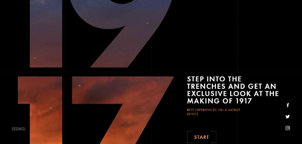
The website created to promote the movie 1917 won Awwwards’ Best Website of the Day. The homepage seems like a preview to a preview, meant to excite the viewers and make them ask for more.
4. Almanac
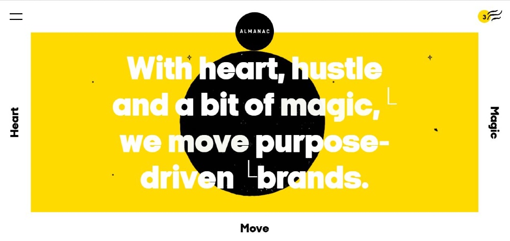
Using animation in their homepage, Almanac overflows with vibrancy and energy. A brand and design company, they successfully showed how dynamic their business is through their brilliant homepage design.
5. Airbnb
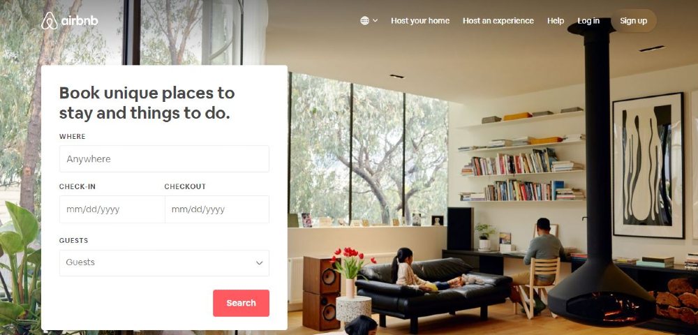
Simple and straightforward, Airbnb‘s homepage design combined substance and beauty really well. It has clear call-to-action as well as suggestions for your next trips.
6. GILK
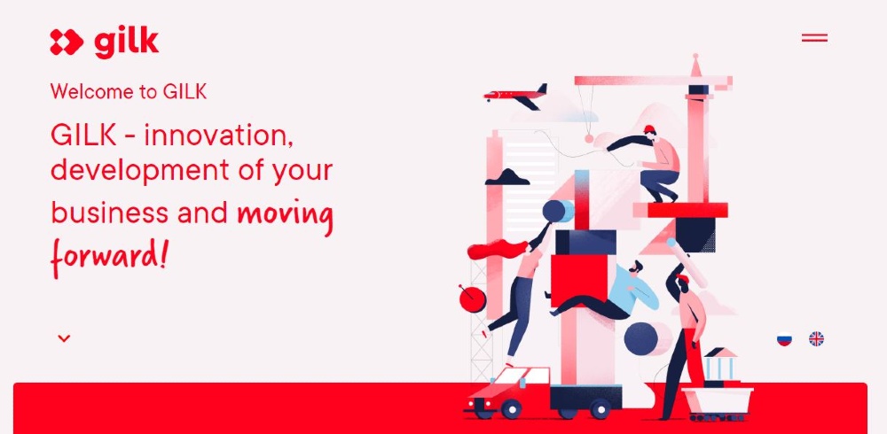
A leasing company from Russia, GILK‘s homepage uses truly captivating illustrations. This compels the visitor to know more about the company and explore the site.
7. Slack
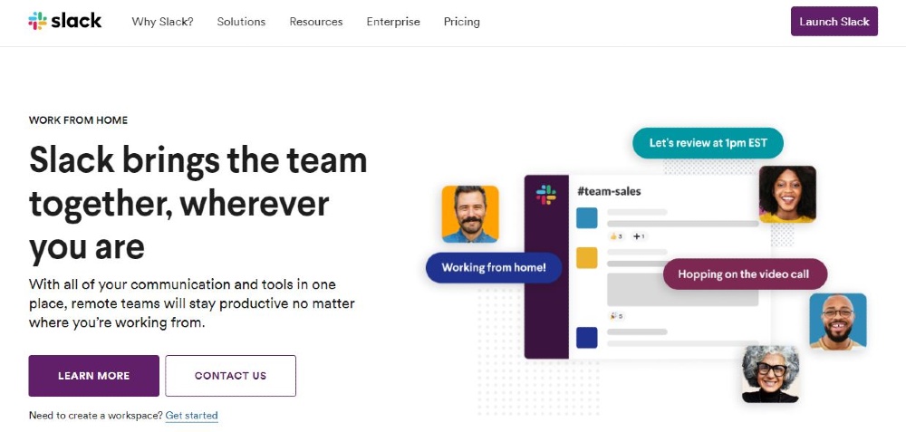
Filled with options for navigating the site, Slack‘s homepage is creative and precise in its message. They tell the visitors how to go about using the tool in a great sequencing of instructions and images.
8. L’Oréal
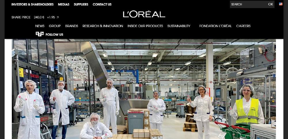
Here’s proof that building strong connections with customers is crucial. L’Oréal updated their homepage design with this image. It shows their solidarity with the world in fighting an unseen monster.
9. Affinity

Using micro-interactions on the homepage, Affinity has taken user engagement to a new level. Animated images appear when you hover over a topic, and they’re all a sight to see.
10. Green Mountain Energy
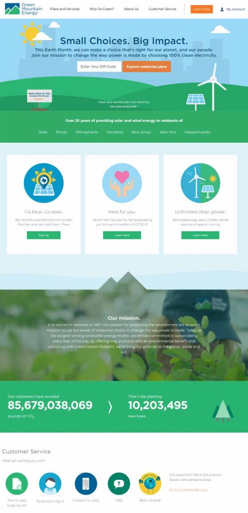
The custom graphics in Green Mountain Energy‘s homepage uses bright and clean colors. The design goes well with their business model that provides sustainable energy.
11. Heineken
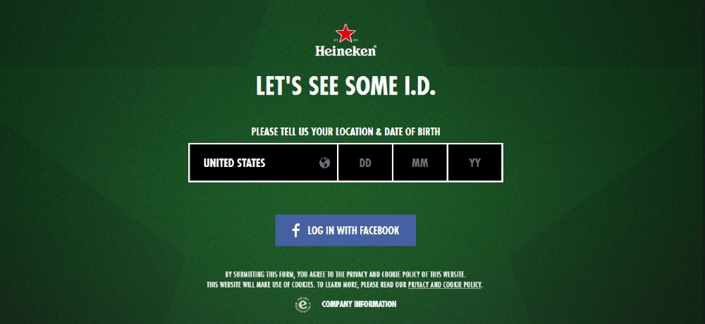
Looking at Heineken‘s website, this page will pop out before you get to the main page. This is responsible marketing, asking for your age before letting you in.
12. Godiva
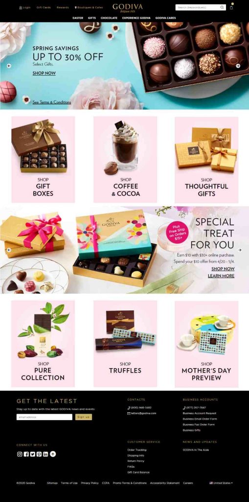
A sight for sore eyes, Godiva‘s homepage design is eye candy, literally and figuratively. The design does an excellent job of drawing the eyes in and compelling the viewers to buy.
13. StudioPress
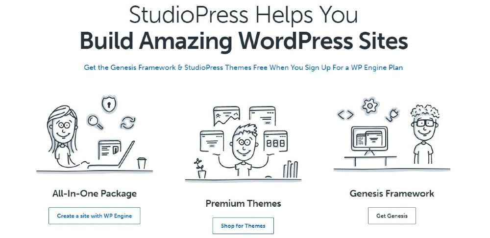
Surprisingly, the minimal colors and flat comic illustrations are precisely the elements that make StudioPress‘ website shine brightly. The CTAs and thoughtful content all point you to where you should go next.
14. Cheetos
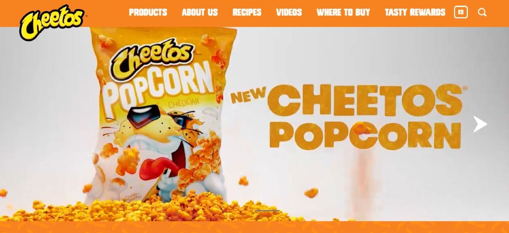
Resonating well with your target audience is what Cheetos‘ homepage does best. It’s fun, dynamic, and has a bubbly quality to it that even snackers of all ages can appreciate.
15. Udemy

Aside from showing upfront their low prices, Udemy‘s homepage shows the massive collection of tutorials and materials they have. The design is straightforward, but the addition of the image of a woman gives it a stylish look.
16. Sanz Lena Photography

A Paris-based photographer, Sanz Lena‘s amazing photographs did all the work on the homepage. This is what they mean when they say, let your product sell itself.
17. Oscar
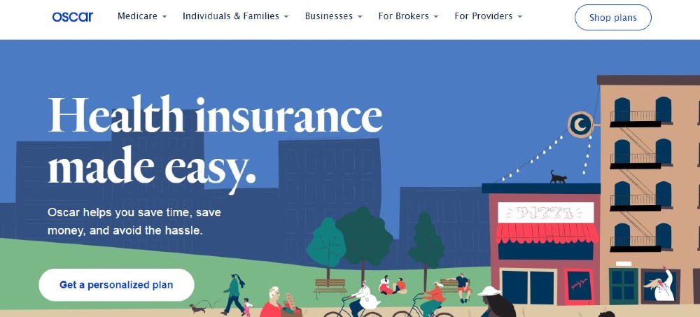
When you think out of the box, you’ll get a homepage design that stands out just like this one from Oscar. Anything about health can be somewhat intimidating, but this design’s feel is quite the opposite.
18. Reebok
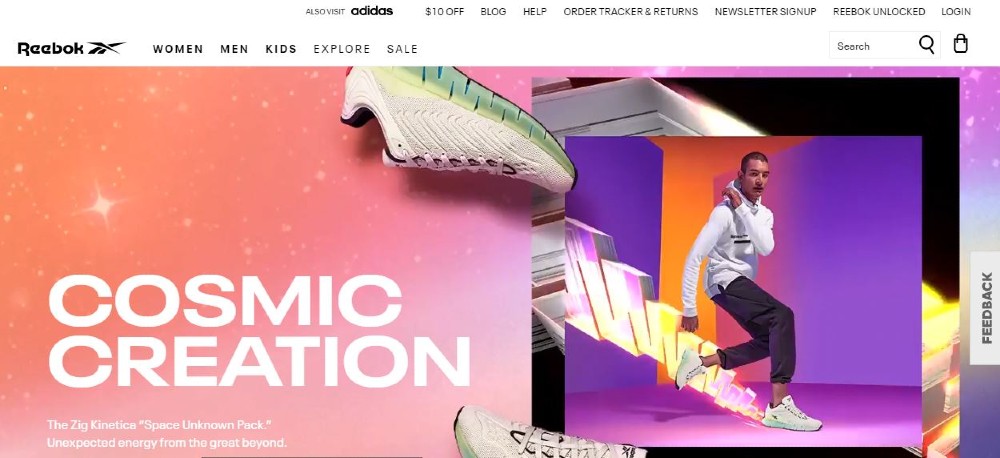
This trendy and hip homepage from Reebok is bursting with vibrant colors and flashing images. With clear CTAs, that’s more than enough to entice visitors to go beyond the homepage.
19. Etsy
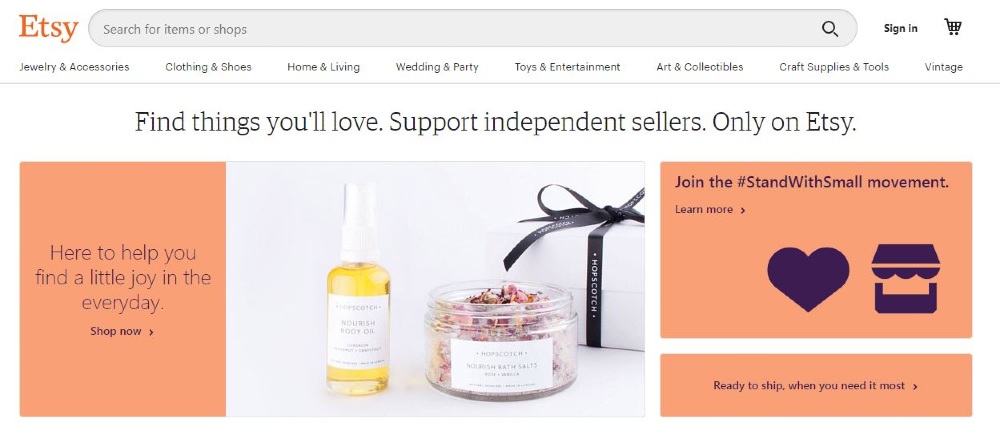
A website for independent merchants, mostly handcrafted items, Etsy evokes an atmosphere of serene and clarity. Browsing is made simple with navigation that’s easy to follow.
20. Tasty Shop
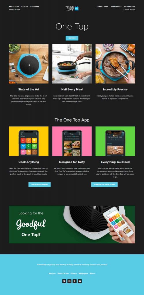
The use of crisp and clear images against a black background makes Tasty Shop‘s homepage design a winner. It gives out a balanced feel of home cooking and advanced technology.
21. Pixelgrade
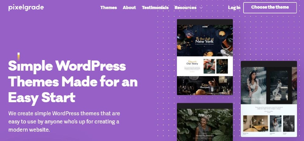
It’s easy to tell what company Pixelgrade is just by looking at their homepage. All your possible queries about them are answered, all you need to do is click on the CTAs.
22. Samsung Galaxy
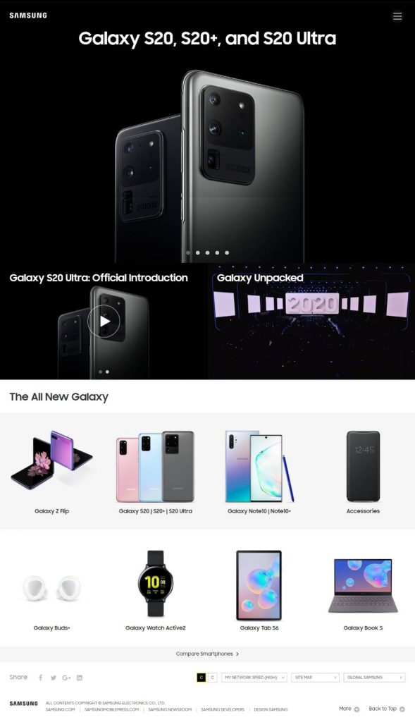
Colors have the power of setting the ambiance, and this is clear on Samsung Galaxy‘s homepage design. In this case, it uses black, which adds elegance, mystery, and excitement to the website.
23. PayPal
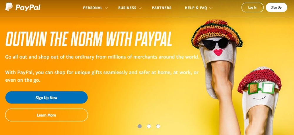
We sometimes associate fintech companies with stiffness and seriousness. PayPal went the less popular route by having a homepage that has bright colors and a laid-back design.
24. American University
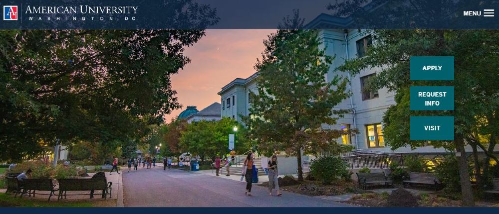
This homepage answers future students’ questions while giving them a sneak peek of what life will be on campus. American University‘s homepage design hits two birds with one stone on this one.
25. Tympanus
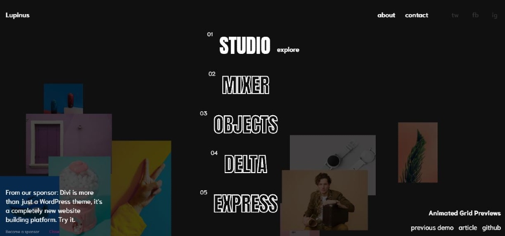
Outlined fonts in a retro style are what give Tympanus’ homepage a great visual composition. It has elements that will catch the attention of visitors—hover effects, intriguing images, and an air of mystery.

