Keep In Mind These 8 Principles of Design
The principles of design go beyond aesthetics. It revolves around psychology. And incorporating design psychology can nudge users to do what they were intended to do.
Since design is an act of communication, translating visuals into subliminal messages, it can move mountains for brands. For instance, having the right design principles on your landing page can urge prospects to make a purchase.
Let’s dig deeper into design principles and what you’re missing on your website and marketing graphics.
1. Hierarchy
Hierarchy is a crucial principle of design. Whether you’re creating a website, poster, billboard, or social media post, structure should be of the essence. Hierarchy separates different design elements or content without having to put boundaries in between. Through the use of headings, subheadings, images, colors, or fonts, the hierarchy can be evident and impactful.
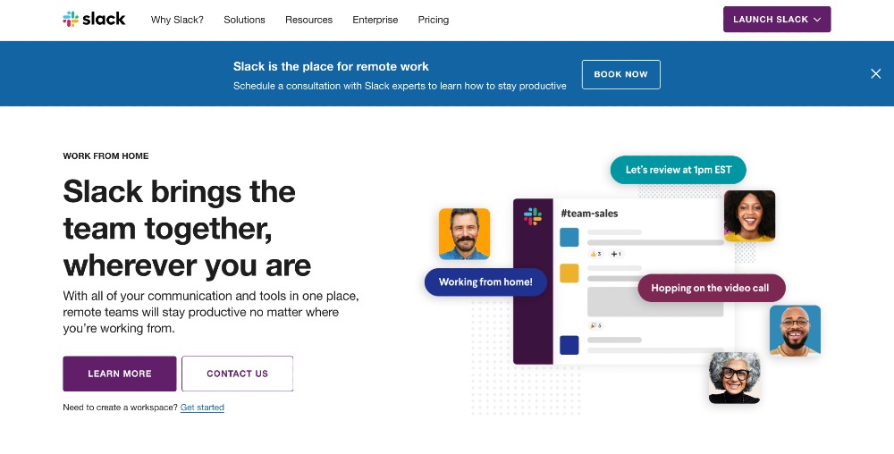
In a nutshell, hierarchy showcases essential information on your overall design concept. To give you a perfect example of a well-executed design hierarchy, here’s Slack’s homepage. The primary heading is the most evident text you can see. Moreover, the short description underneath in smaller font size leads the eyes down to the calls to action.
However, your eyes also end up in the text with the blue background and call to action. Slack clearly wants its audiences to schedule a consultation with them or contact them to learn more about their services.
2. Contrast
Contrast is another principle of design that can make the most critical components pop. And there are various ways you can apply contrast to diversify components and still make them aesthetically pleasing.
For one, you can achieve contrast by applying different sizes. For instance, you can combine typefaces and font sizes to make the most important message stand out. Another way is to include various shapes to prevent your designs from looking monotonous. Having different visual shapes implies playfulness.
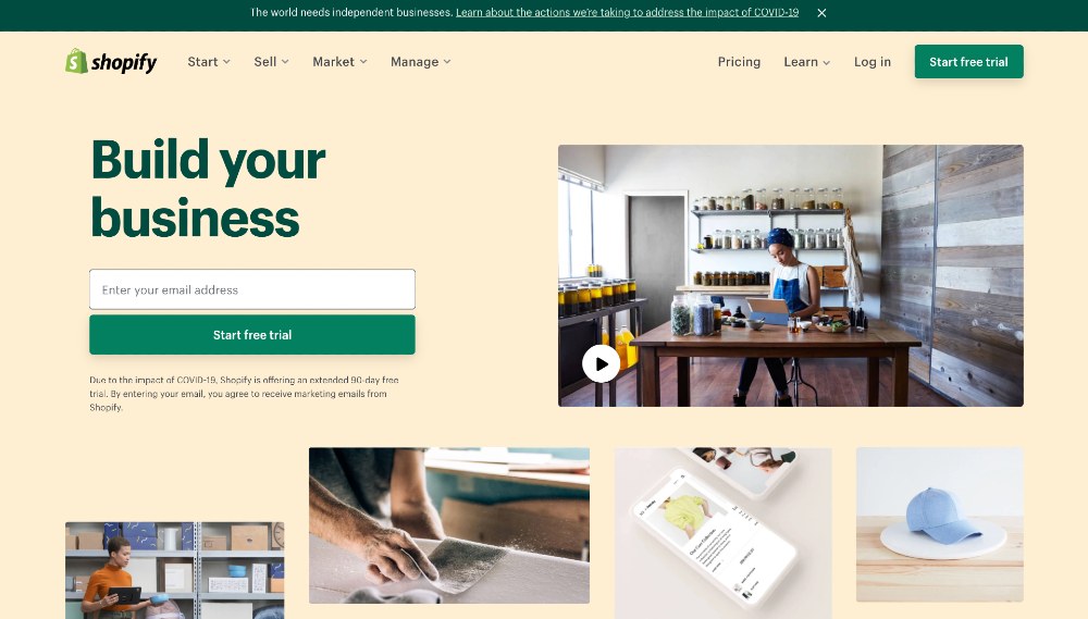
Lastly, achieve contrast by giving your website various splashes of colors. Take Shopify’s web page, for example. Contrast is clearly evident through the use of a pastel-colored background and complementing it with solid green colors. The most vital contents are in green, which are the main heading and the call-to-action buttons.
3. Balance

One of the most important principles of design is balance. Balance gives designs a visual mystery and interest. You can attain balance in two ways: symmetrical and asymmetrical.
While symmetrically balanced designs have equal visual weight on both sides, asymmetrical is the opposite. Symmetrical designs revolve around an invisible line in the middle. On the other hand, asymmetrical designs don’t have a central line. Here’s Dropbox’s homepage for a balanced design. Overall, the laptop on the right side versus the texts on the left side creates harmony.
4. Emphasis
Emphasis centers on a couple of design elements. In layman’s term, emphasis means giving more weight on essential content. Whether you try to achieve this through images or headings, emphasis should be created around proportion and repetition.
For instance, the “fine print” on any design project holds the most insignificant relevance. The bigger the text also means the more significant the information. Furthermore, proportion also gives visual weight to the most notable content. For instance, making sizes and images bigger than the rest is useful to convey your message. Yet, this still gives your designs a unified look.
Last but not least, repetition is crucial to educate users and emphasize what your brand message is. It’s a tactical reinforcement that can instill your brand ideas, principles, and personality into your audience. That means repeating your brand colors, icons, logos, shapes, and messages.
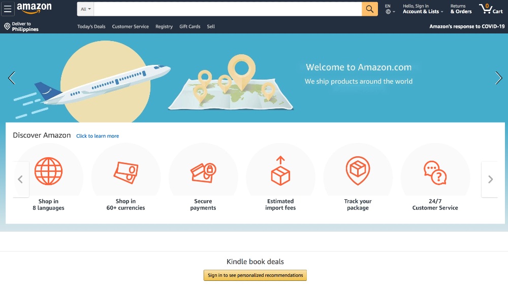
Check out Amazon’s homepage. Merely putting the search field on top nudges users to immediately type what they’re searching for. The different icons below also assist buyers in learning more information about Amazon’s services. Ultimately, as an eCommerce business, Amazon is straightforward with their design approach.
5. Rhythm
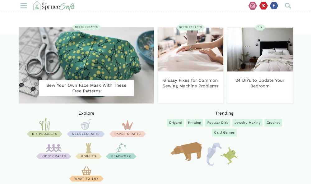
Rhythm creates a harmonious composition to the overall design concept. Having spaces in between design elements can bring cohesion, contributing to beautiful visual rhythm. Overall, visual rhythm can set the mood and engage your audience in your design. By creating rhythm through spacing in designs, it leads the eyes from one design element to the next. Here, The Spruce Crafts’s website achieves rhythm through repetition of headings, icons, and pastel colors.
By integrating intervals between designs, you achieve visual rhythm. You can do this in three ways:
- Repetition (creating patterns through predictability)
- Alternation (creating patterns through contrast)
- Gradation (creating patterns via progressions of steps)
There are also three types of rhythms:
- Regular (when patterns are similar in size and length)
- Flowing (when the patterns are ornamental or organic)
- Progressive (when patterns are displayed through a progression of steps)
6. Pattern
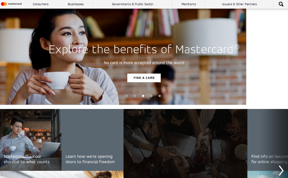
Pattern is one of the principles of design that give users a sense of familiarity. For example, the navigation menu, which is typically always on top, is commonplace. Displaying them on another part of the website can confuse users. Another way to develop patterns into your designs is to enclose them in shapes such as grids or circles. One example of a conventional pattern is Mastercard’s website.
7. Movement
Movement is also another design principle that gives life to your designs. Moreover, movement establishes flow even on static images. As long as you incorporate subtle elements that imply movement, it can change the way users view your design.
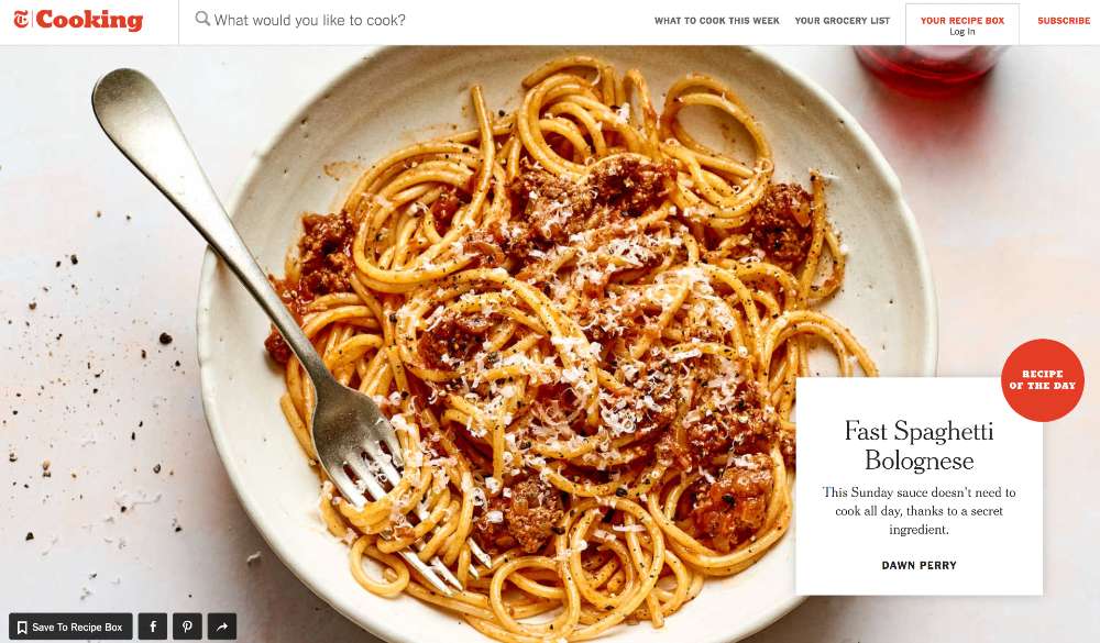
This NYT Cooking website’s hero image is simple yet paints a picture of a diner twirling spaghetti with a fork. By simply including a fork with twirled spaghetti, the dish transforms into an object in motion.
8. White Space
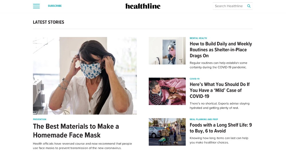
When designing with users in mind, marketers can provide audiences with seamless experiences. And that means, letting their eyes breathe when browsing through everything. Through white space or negative space, designers can include empty spaces to relax the eyes.
Empty spaces also lead the eyes to the next design element without overwhelming. Plus, white space is an excellent way to make design elements pop just like Healthline’s homepage.