These 11 Amazing Web Pages Will Wow You

Any company, regardless of industry, knows its business website can rake in the goodies. It’s the conduit between the brand and its audience. Of course, this fact no longer needs emphasizing. Every brand initially builds its website from the get-go. But do brands really know what it takes to create a well-designed web page?
If you haven’t started with your website design, hiring professionals can get the job done. Penji is a subscription-based graphic design service that not only works on your web page but also on just about any design project you might need.
Businesses don’t have to break new grounds when it comes to website design. Sometimes it’s the most straightforward and tactical things that matter.
Here are 11 of the most well-designed web pages that give their customers enjoyable and seamless browsing experience.
ESPN
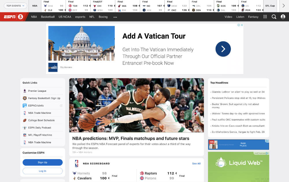
Founded in 1979, it’s no surprise why ESPN still reigns supreme out of all sports channels today. Not only do their show segments keep you riveted, but so does their website.
Once you land on their homepage, snippets of various content will welcome you. However, the layout is cleverly designed that every information is digestible.
You get the team scores on top, a clean header underneath, an image snippet of a live video of the hottest sports action, and the trending headlines on the right side. Overall, the layout is uncluttered, and a considerable amount of white space makes it work.
Zillow
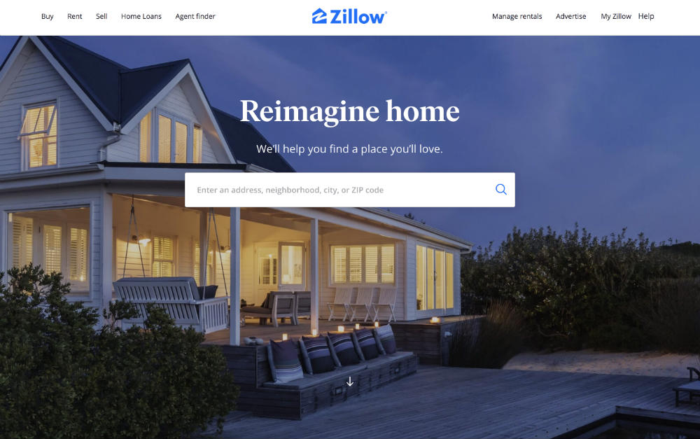
Easy navigation is vital for a business website. It’s an element that can make or break a sale. And Zillow, one of the leading real estate marketplaces, ensures their web page prioritizes navigability.
Zillow features a hero image on the main page, followed by a search field to instantly let users interact. Once users scroll down, the brand further narrows down the users’ search goals through three categories.
- Buy a home
- Sell a home
- Rent a home
It’s a well-designed website because it’s simple and lets even the most tech-illiterate individual browse with ease.
Alex Buga
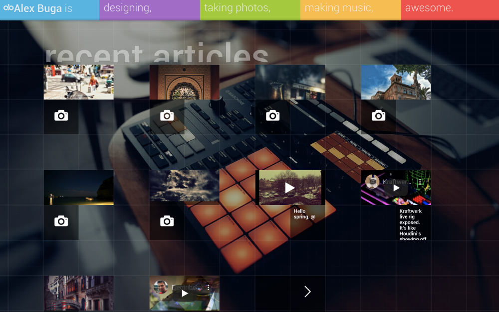
Alex Buga is a virtuoso when it comes to art, music, and web design. And his portfolio website is unlike any other. It showcases his modern style while still keeping functionality in mind.
He takes advantage of grids to display bite-size information about his various works. You can hover or click over the images and videos or click on the multi-colored header for other options. Overall, his website is a fun take on fresh and unique designs.
Morgan Stanley
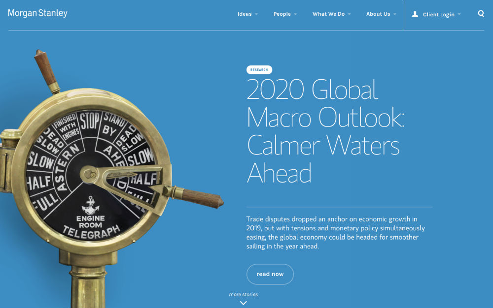
Morgan Stanley is a New York-based multinational bank and financial institution. Breaking barriers in traditional industries like banks, Morgan Stanley shows growth and versatility in its web design.
Its homepage dons an attractive and amiable light blue color palette. There’s an oversized image of an engine order telegraph, with the hottest industry news beside it. Once you scroll down, you’ll see a grid displaying different brand contents, which are easy to digest.
Basecamp
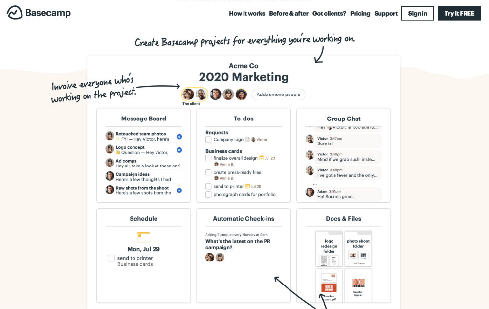
Basecamp is a project management software that caters to businesses. It helps companies collaborate on projects through a user-friendly system.
I love how they featured a screenshot of their software to give audiences a low down on how it works. The header is also limited to several options: How it works, Before & After, Got Clients, Pricing, and Support. The web page adheres to the 3-click rule in web design usability.
Zero
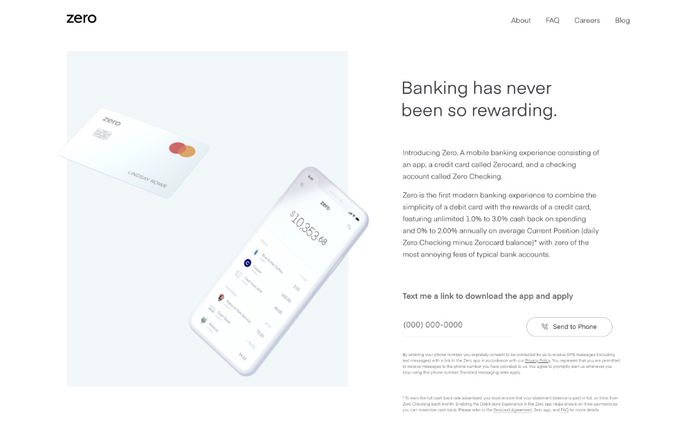
Zero is a mobile banking app for credit cards and checking accounts. And I must say, the website design’s use of negative space is exceptional. It’s uncluttered, easy on the eyes, yet informative. Overall, Zero’s website is a standout.
The Cool Club
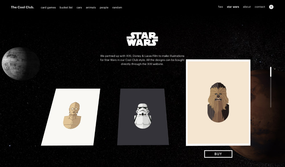
When it comes to all things cool in web design, The Cool Club emerges as one of the best. The most notable feature is the hover effects that make browsing enjoyable. The website also features fun animations and clips that say a lot about the brand’s products. After all, their cool card games are is what make them famous.
Slack
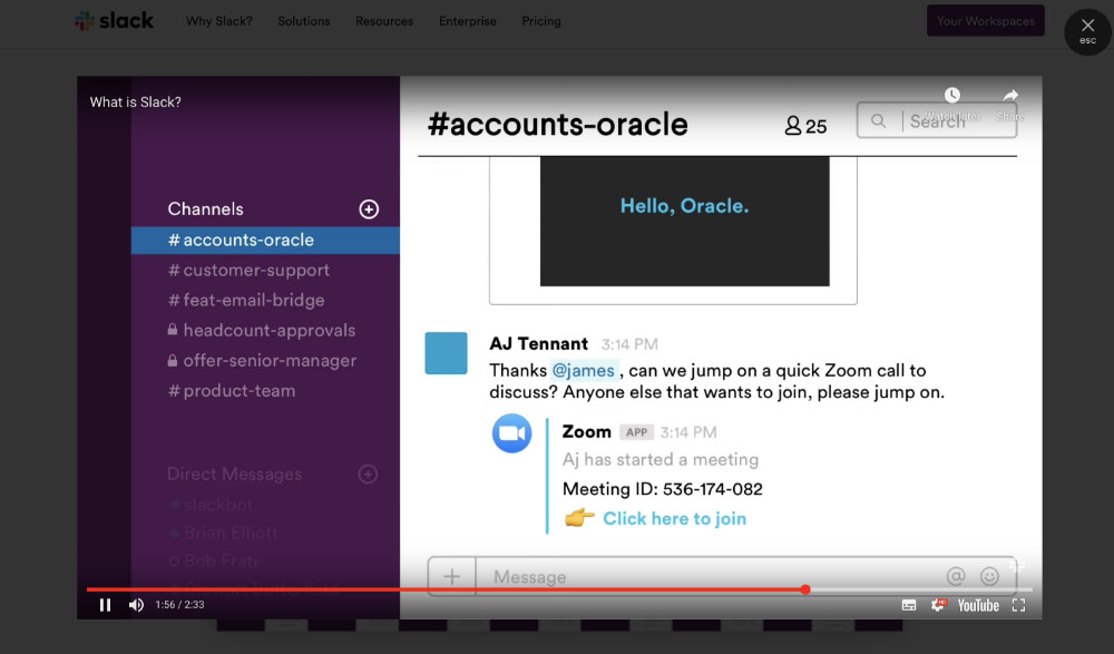
Slack is a messaging platform for teams and project collaborators. It’s somewhat similar to IRC, but with more integration benefits. And Slack makes sure that users understand and familiarize their software the moment they visit the site.
Since video content is a rising web design trend, Slack leveraged the power of video on their website page. It’s a 2-minute video explaining the challenges of remote teams and how Slack can help them enhance their communication.
Amazon
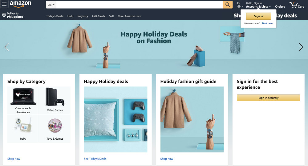
An eCommerce site like Amazon uses convenience and easy navigation on their web page. I love how the online store changes up the main page according to the occasion. The site also has an efficient filtering system that lets buyers find what they’re looking for effortlessly.
The checkout system is relatively easy, as well. The product pages also have brief and helpful descriptions, along with social proof. For the eCommerce niche, these components can keep those carts full.
Phillips
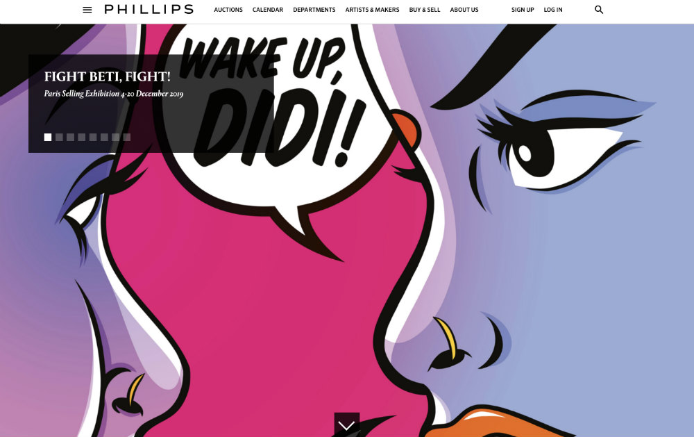
Phillips is a platform where you can find the most contemporary designs, art, photographs, watches, and more. It’s a buy-and-sell channel open for international collectors.
The brand uses carousels on their main page to list upcoming auctions and exhibits. The various beautiful artworks and products are also utilized as a background. For a website that showcases art and collector items, this hooks willing buyers and sellers right off the bat.
Spotify
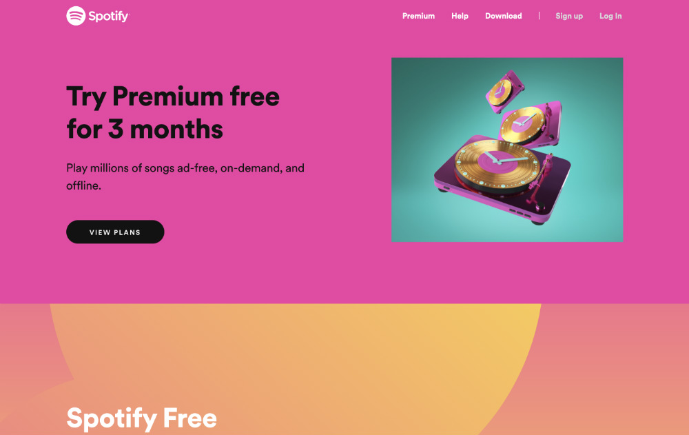
Keeping your favorite sounds and podcasts on the go, Spotify spearheads the entertainment industry with its affordable subscription. The bright color schemes accentuate every piece of information on their website.
It’s also mobile-friendly, or gadget-friendly, in general. The header options turn into a hamburger menu when minimized or when viewed on mobile. Overall, it has a festive appeal that’s akin to the brand’s identity.

