Expert Website Design Tips to Increase Conversion Rates

While current web design trends sit along the lines of modern, fresh, and simple aesthetics, some good old website design characteristics still remain practical.
Out with the old, in with the new, as they say. However, creating a website still involves some old hacks that keep it effective. Let me share with you some techniques to make your web design convert. If you already have one that needs revamping, read on to learn some tips on website redesign as well.
Adequate White Space
Given that you already have impressive graphics on your website, next is to focus on the layout. White space or negative space pertains to the “empty” space between a variety of elements.
White space is essential to keep your images, texts, and all the other components organized. It also helps with the flow of your layout from top to bottom. Typically, the website content or body should don as much white space because it’s where information is mostly displayed.
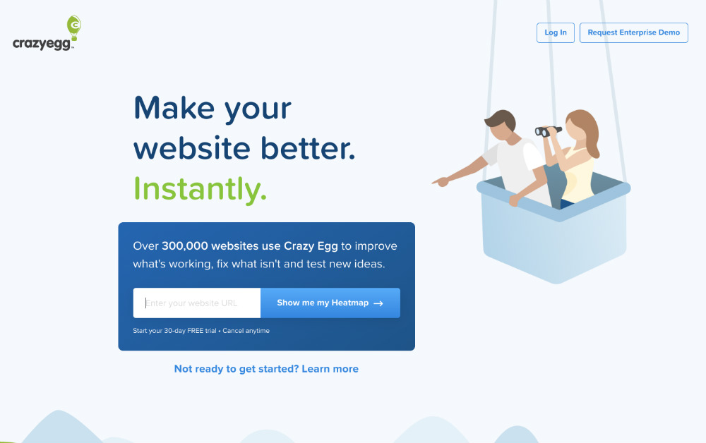
Check out Crazyegg’s website design. The layout has the logo, graphics, headline, and call to action separated cohesively by negative space. All in all, the design is clean and orderly.
F-Pattern Hierarchy
Visual hierarchy is fundamental in web design. A brand must display the most significant information according to how users view websites. According to the Nielsen Norman Group, web designers and owners sometimes overlook the F-pattern. But according to studies, users scan a website in an “F” manner, which means:
- Users scan the website in a horizontal manner, starting with the site’s top header.
- Users then move down onto the left area and breeze through the second level horizontally. But this time, scanning the second level in a shorter scope.
- Lastly, users continue scanning the rest of the left area vertically.
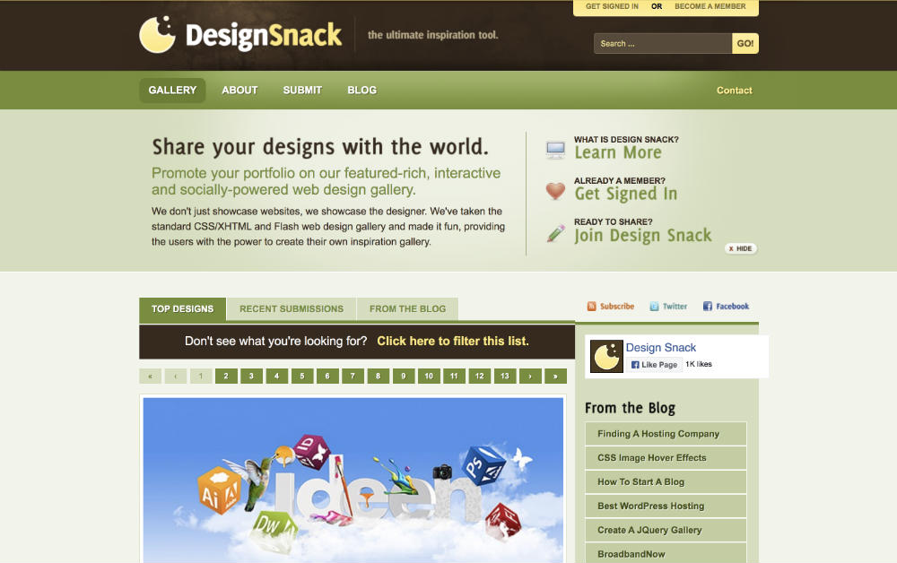
Here’s an example from DesignSnack. What’s strategic about this design is that the copy is on the first “F” horizontal line. When you get to the tip, the brand provides you with several call-to-action phrases. But when you move down to the second line, the information is just as important.
Clean Headers and Footers
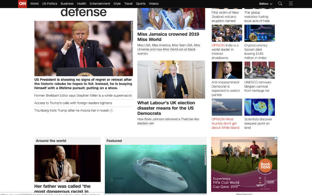
A header is a component that you see at the top of each site’s page. It’s what the user initially sees when landing on your website. That said, designers prioritize logos, contact information, navigation links, sign up forms, or search fields on the header. I can’t think of a better example of a clean header than CNN’s. When you get to the main page, you can easily navigate through the site’s various news categories.
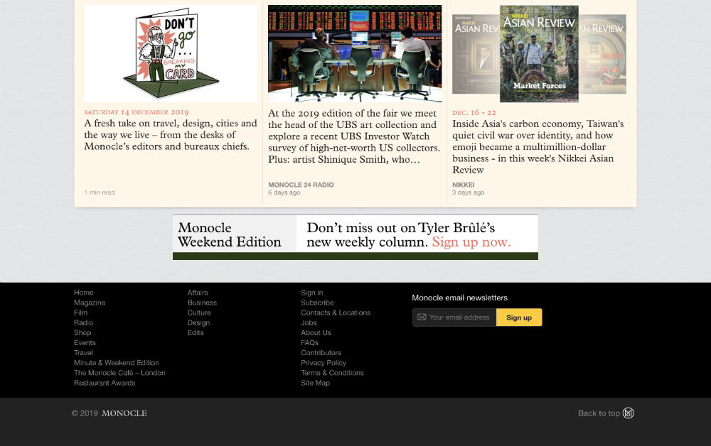
Of course, the footer is just as important as the header, even though users tend to browse footers last. But they usually do it because they couldn’t find the information they were looking for in all the other pages. Here’s Monocle’s comprehensive and clean footer design, categorized into three columns.
Relevant Color Scheme
A consumer’s buying decision is partly based on colors, and there is a psychology behind this. When colors strike the human eyes, they disseminate information to the hypothalamus. In turn, it sends signals to the pituitary gland. The signals then work their way into the endocrine system and thyroid glands. This stream of communication releases hormones that affect our mood and behavior.
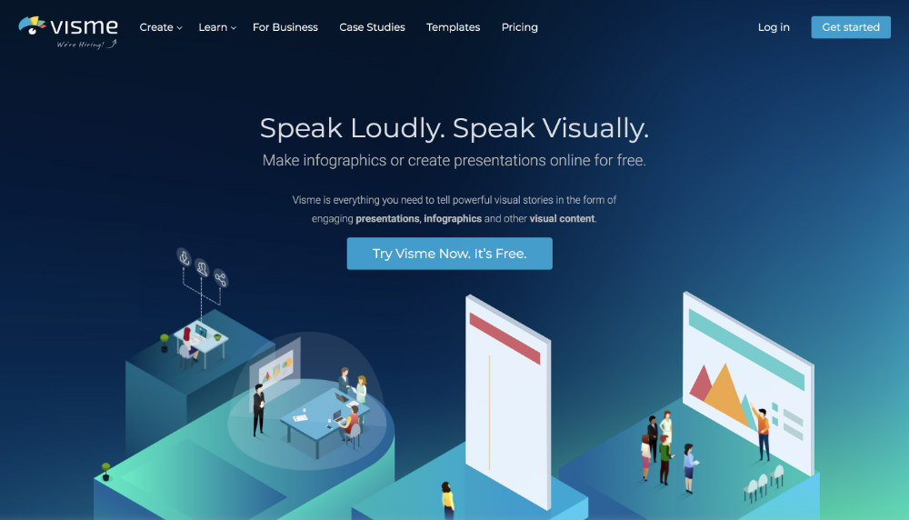
That’s why choosing the right color palettes for your website design is crucial for your business. The colors must represent your brand identity and resonate with your target audience. Take Visme’s color scheme, for example. Since this company works with fresh ideas and visual content, the dark and green colors are apt for its branding.
Suitable Typography
Typography doesn’t refer to the typeface used on your website. But it’s how you weave together several typefaces and font styles into one harmonious and dynamic look. Here are some tips on maintaining uncluttered, tasteful website typography:
- Stick to not more than three font families
- Focus on line length to make texts readable
- Pick a typeface suited to your branding and audience demographics
- Take note of kerning and leading
- Color contrast for readability
- Pick a mobile-friendly typeface
- Use ALL CAPS sparingly
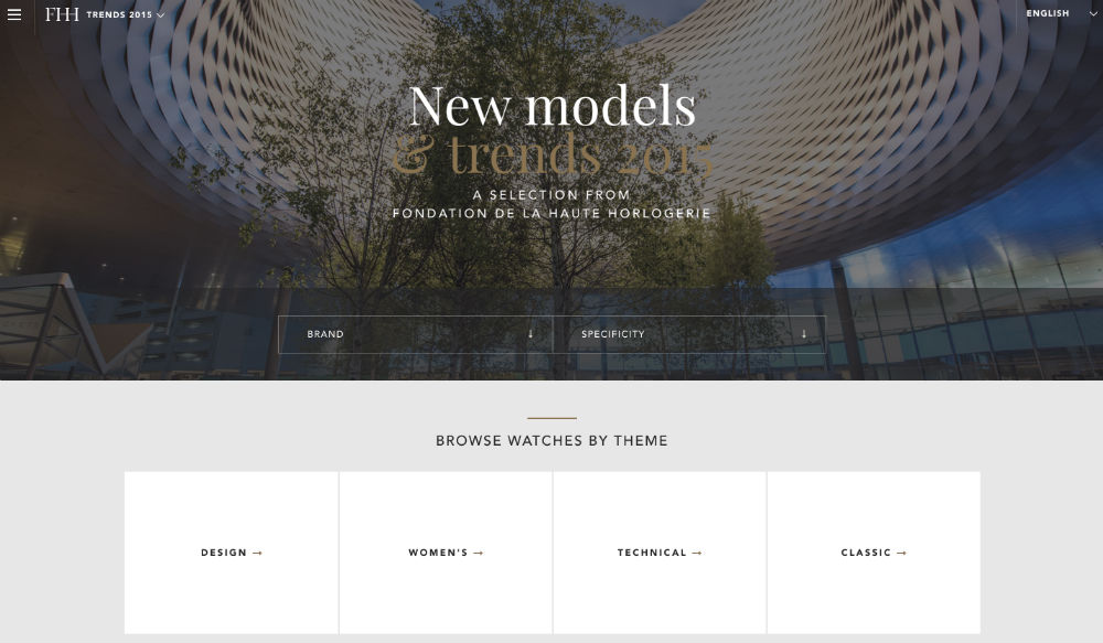
This horology website mixes traditional serif and contemporary sans serif font styles. The entire look is classy and radical, yet maintains a modernistic flair, akin to the company’s focus on watchmaking.
Concise Web Copy with Call to Action
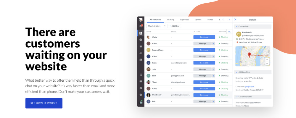
Users stay on your site when you give them what they’re looking for in the first few seconds. One way to do that is through a concise web copy. And here’s LiveChat’s homepage’s brilliant copywriting with no frills.
First, the headline sparks urgency and at the same time, highlights a customer’s pain point. Next is a brief explanation of a solution to their pain point. And lastly, it’s coupled with a compelling and evident call-to-action button.
Overall, the first page itself is enough to make a user engage and take action.
Mobile-Friendly
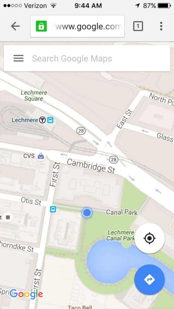
Mobile compatibility is a website design trend that will never go outdated. Make sure to check your website’s mobile responsiveness regularly. Two ways to know that you’re up-to-date is when your site is navigable on a mobile phone and when the load time is fast enough. Google Maps is a perfect example of this.
Interactive Web Design
Getting your users engaged throughout their browsing experience is important, so they stay on the site longer. By using interactive features, you can get them to do simple things like clicking, choosing, typing, and whatnot.
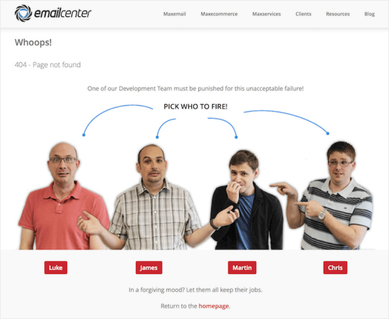
Email Center took a new approach to 404 messages and interactivity. Instead of using the cliche 404 error messages, they creatively let users pick to get them engaged despite the downtime. Plus, this method also lessens the frustration in the user’s part.
How to Revamp an Old Website Design
As users’ web viewing preferences evolve, web developers must also keep up with the trends. Additionally, web owners must be attuned to any branding upgrade, hence, a website redesign.
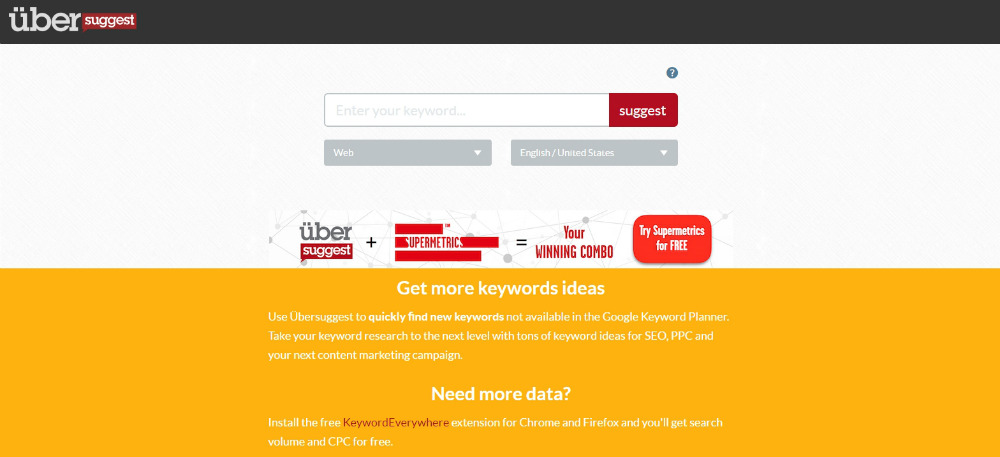
For instance, when Neil Patel bought Ubersuggest, it looked nowhere near his branding.
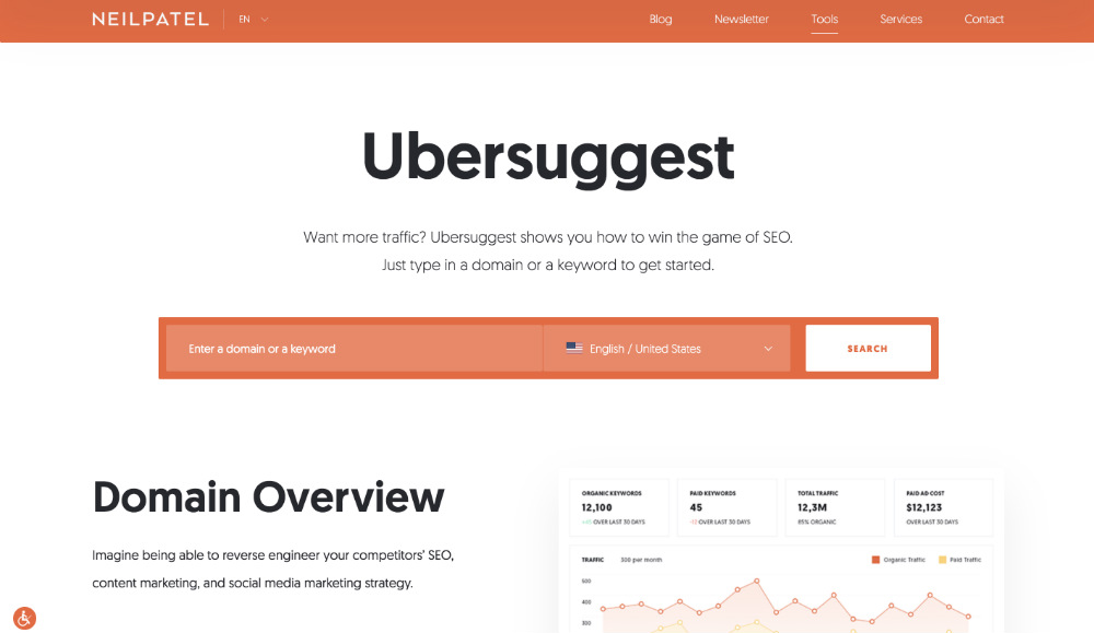
To make it more in line with his personal blog, he gave it a complete overhaul, and Ubersuggest now has a more updated look.
That said, when revamping your website, take note of these steps:
1. Check which design elements are outdated. Better yet, scour through web design-related complaints and address them.
2. Stalk your competitors’ websites and gather web design trends they’re using.
3. If it ain’t broke, don’t fix it. Maintain those web design elements that are raking in sales. If not, make them better.
4. Keep up with SEO trends and make the necessary changes.
5. Design a wireframe before you make revisions.
6. Maintain brand consistency.
Conclusion
Whether you’re starting a website from scratch or revamping an old one, always ensure to keep your eyes on the ball — website functionality and user experience. After all, a business website should be built around your customers for maximum conversions.